1. Summary
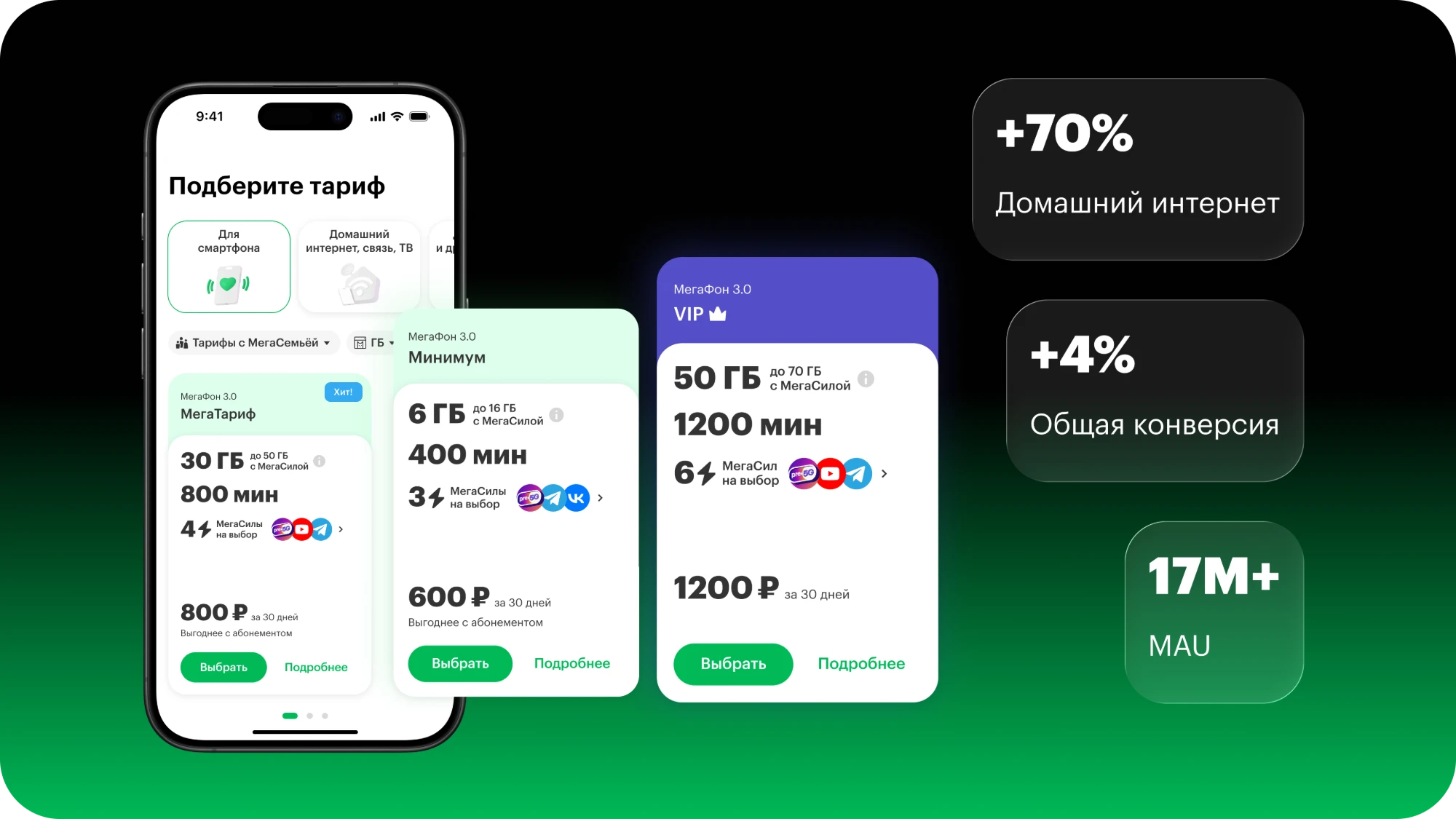
A redesign of MegaFon’s plans showcase for the website and mobile app. The goal was to make it easier for customers to choose a plan and increase sign-up conversion through a clearer plan card, filters, and transparent presentation of add-on options.
Success metrics
+44%plan purchase conversionfrom 9% to 13%
3.4 → 4.2Customer Effort Score
-17%average time to choose a plan
745 → 1,283home internet sign-ups per month
44% → 21%conversion gap between site and online store
+11%MegaSily add-on uptake
2. Context
About the company
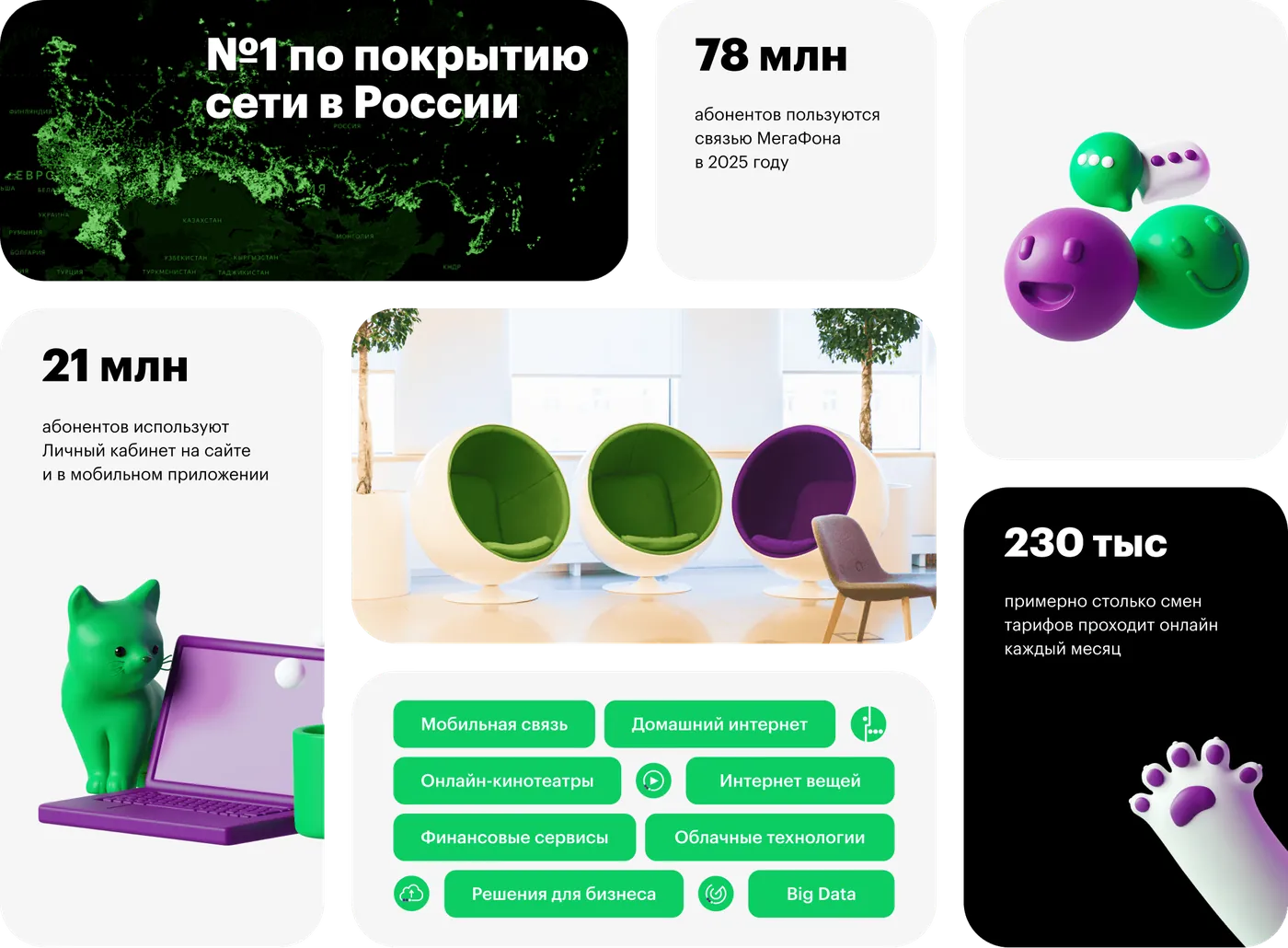
MegaFon is one of Russia’s largest mobile carriers. In 2024 the team set out to rethink the digital experience: make choosing a plan simpler, faster, and clearer for millions of users.
Business challenge: what was hurting the product
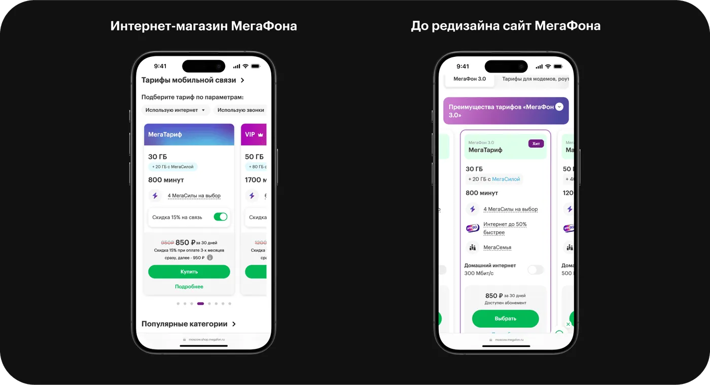
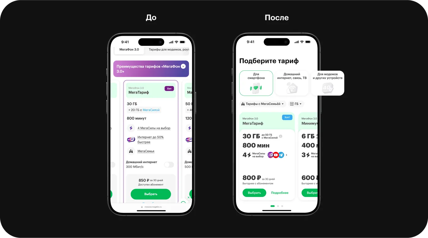
Interviews with the business and an audit of the existing showcase showed that the plan card in the online store converted better than the card on the main website. On the main site, users ran into a lot of distracting blocks: home internet, MegaSemya (family plans), pre‑5G, and other offers competed for attention and made choosing harder.
Why this mattered: the plans showcase is one of the key entry points into signing up. If it’s hard for a user to compare plans and understand the value of add-on options, they take longer to decide, hesitate more, and convert worse.
UX testing of the old MegaFon plans showcase helped us pin down the key problems that shaped the redesign decisions:
“MegaSily” don’t spark interest, even though the business planned to position them as plan customization and an alternative to a plan builder.
Users don’t understand what “MegaFon 3.0” means — this especially hurts navigation.
Users are skeptical of pre‑5G — they don’t understand why it matters.
Cards feel overloaded and too long — hard to compare.
The gradient banner reads as an ad — it breaks the structure and gets ignored.
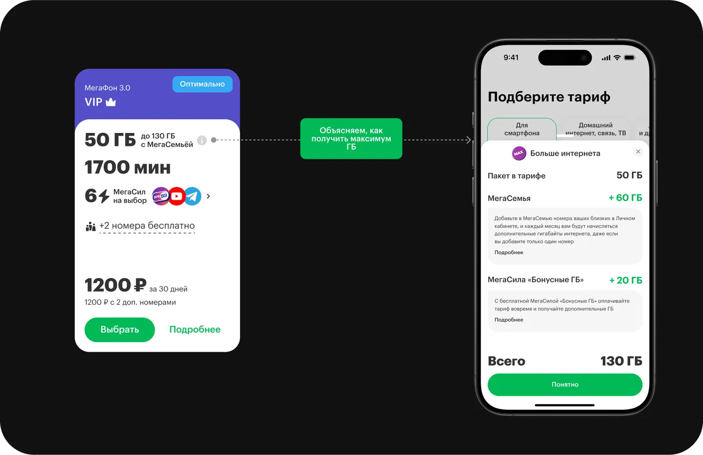
It’s unclear whether extra GB are already included in the plan — this raises doubts.
These findings shaped the redesign: a focus on transparency, priority information, and easy choices without extra noise.
3. Solving the problem
Defining the problem
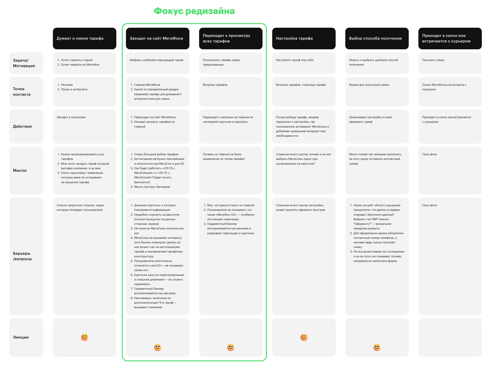
Before jumping into UI, I mapped out the plan-selection scenario through a CJM and formulated a JTBD, hypotheses, and success metrics. This helped separate real user problems from business wishes and focus the redesign on choosing, comparing, and signing up.
JTBD: when I’m choosing a plan, I want to quickly understand which one suits me best, so I can be confident I made the right choice and I’m not overpaying.
Simplified CJM
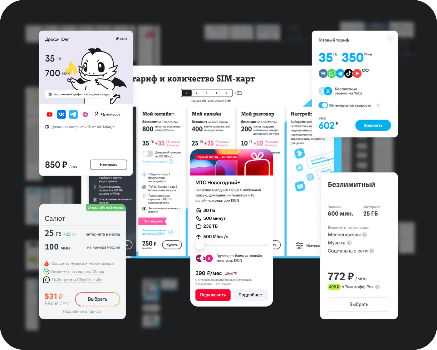
Competitive analysis
Redesign brief
Simplify the visual and informational load of the plan card, while making it more adaptive to the user’s context and goals.
Success metrics
- Plan purchase conversion
- Customer Effort Score
- Gap with the MegaFon online store
- Time to complete plan sign-up
Hypotheses
- If we simplify the plan card and leave only the key parameters (GB, minutes, price), users will find it easier to orient themselves, speeding up plan selection.
- If we put more emphasis on MegaSily, users will be able to adapt a plan to themselves without a plan builder, reducing the need to build one and increasing purchase conversion.
- If we add filters that dynamically adapt the cards to user behavior and needs, it will improve navigation, speed up selection, and positively affect conversion.
- If we move home internet into a separate section and reposition the mobile plan cards, it will reduce cognitive load when evaluating bonus GB and minutes, and make the plan visually and substantively clearer and more appealing.
- If we add the ability to customize home internet speed, plans will become more flexible and relevant — broadening the audience and boosting conversion.
Option 1 — the business proposal
Make the first filtering level based on usage scenarios:
- For myself
- For family
- Home internet, calls, and TV
- For modems
- For feature phones
Selecting a given filter surfaces information about MegaSemya (family plans) and home internet. The second filtering level was inspired by the online store’s plans showcase — showing hints about the internet and minutes package.
Emphasis on family plans, since they’re surfaced as a first-level filter
The filter works, but it’s visually unnoticeable: the card barely changes, and the user loses the sense of being in control
The card is lighter, but MegaSily still doesn’t register — visually it gets lost against the main content
A large number of first-level filters makes navigation harder — users get lost in the choice
MegaSemya information isn’t revealed on the card — users don’t know how many numbers can be added or on what terms
MegaSemya and MegaSily look and sound similar — placed next to each other on the card they blur together and hurt comprehension
Option 2 — rethinking the plan card and filters
In this version, I proposed rethinking the plan card design and filter logic. We removed everything that was distracting and reinforced what helps users decide.
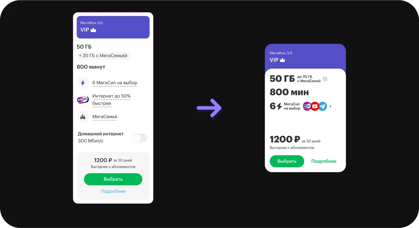
Emphasis on core parameters — GB, minutes, MegaSily, price
MegaSily became more noticeable: now with icons, they draw interest and engagement
The wording “up to 70 GB with MegaSila” doesn’t confuse users: extra detail is available via the “i” icon
The card is shorter, making plans easier to compare
The first choice step became simpler. Cutting filters from 5 to 3 and adding illustrations improved focus and interest.
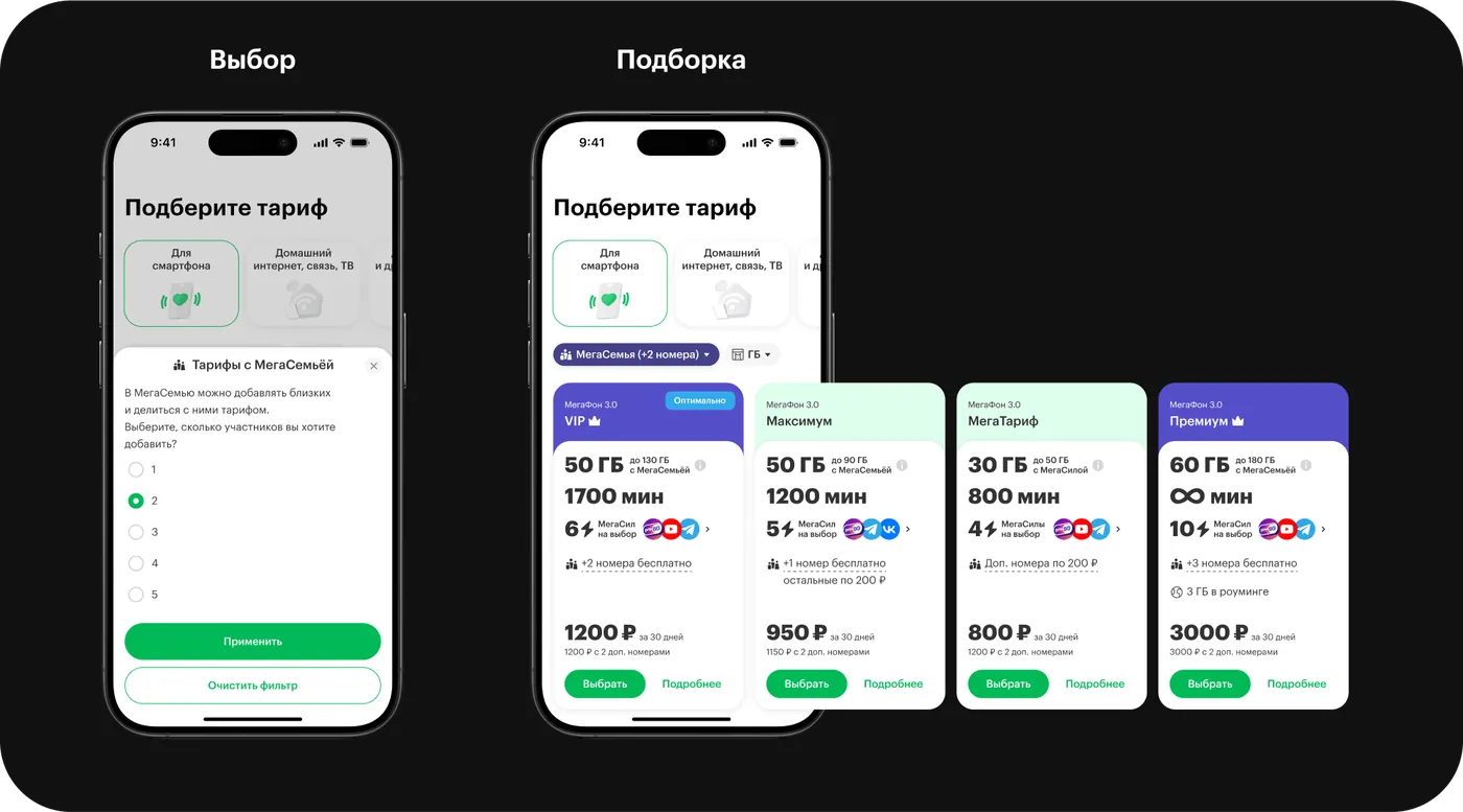
MegaSemya (family plans)
We added a “Plans with MegaSemya” chip — tapping it opens a bottom sheet where users pick the number of extra lines. Terms vary by plan.
- Cards adapt to the user’s needs: depending on the number of extra lines, plan order changes and an “Optimal” badge appears, helping users decide.
- Below the price, the plan’s cost with extra lines is shown, so users don’t have to calculate it themselves.
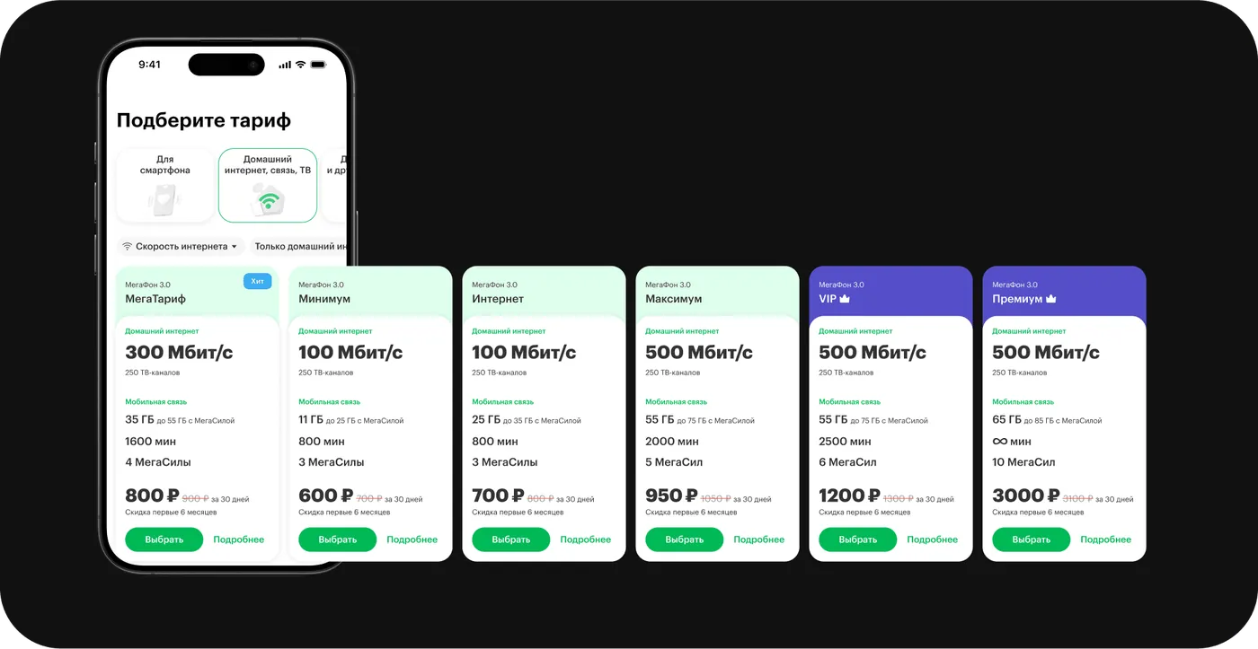
A new focus — home internet
We shifted the emphasis in how plans are presented:
- Home internet speed is now in the foreground.
- Mobile service remains, but is now secondary.
What else we did:
- Added chips for quickly choosing the speed you need.
- Introduced home-internet-only plans for the first time.
This approach highlights the main thing — home internet — and broadens choice without overloading the showcase.
MegaSily
Users now better understand how extra GB are credited. For remaining questions, they can go to the service’s landing page and check the FAQ.
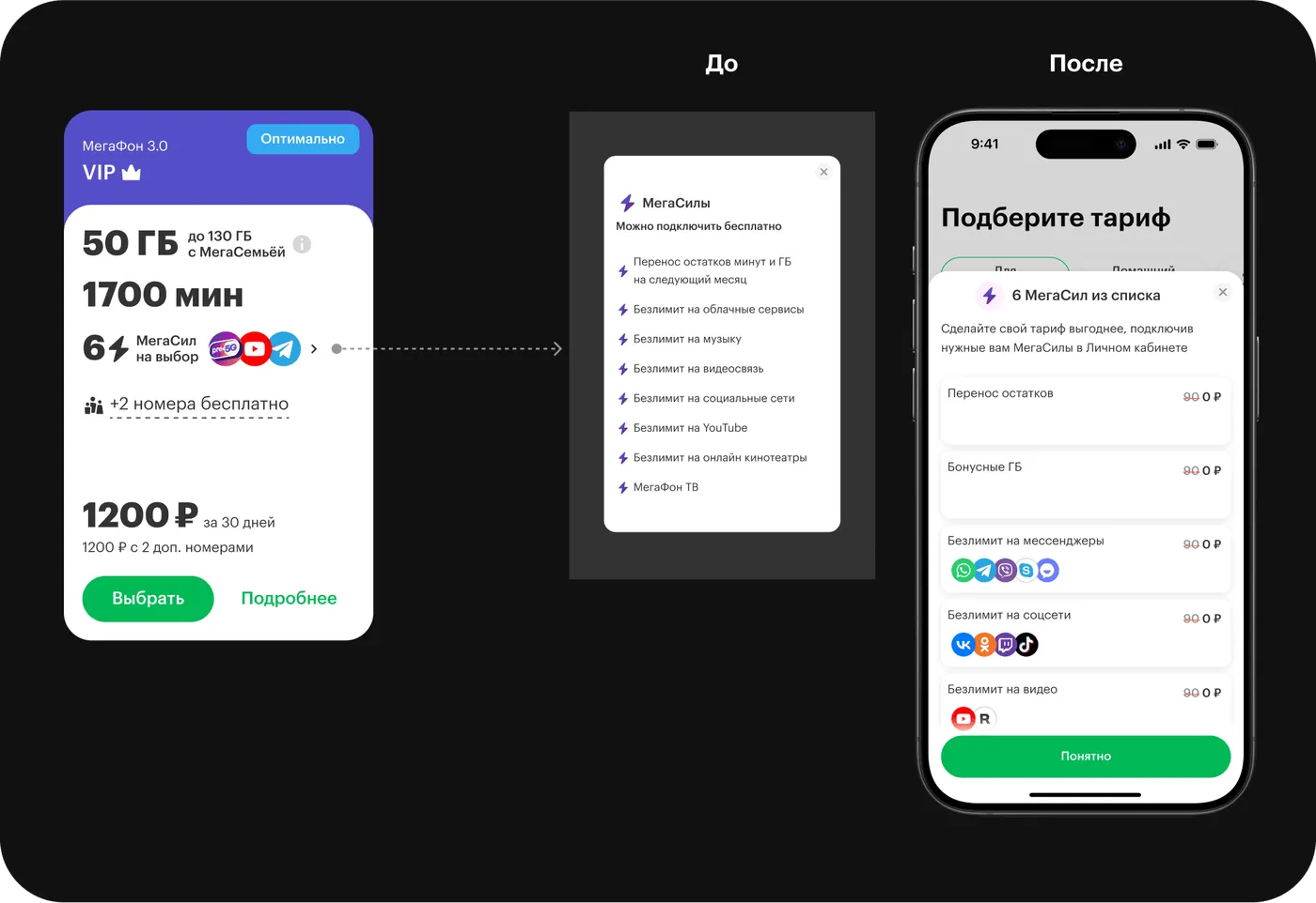
- MegaSily became visually clearer: icons for included services now appear.
- Each MegaSila is clickable — users can see the details.
- Added a price comparison — users see how much they save thanks to the MegaSila included in their plan.
Signing up for home internet — simpler and clearer
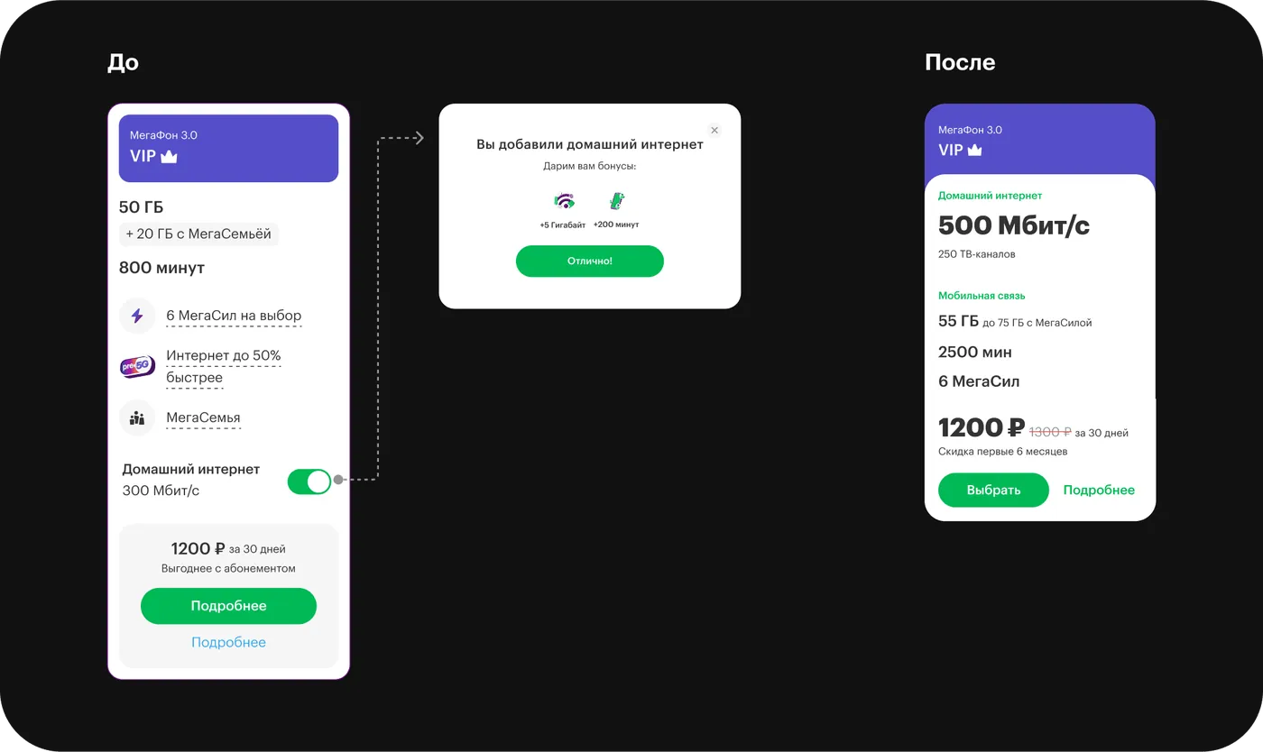
Previously, trying to add home internet opened a modal window. It interrupted navigation and appeared on every interaction. At the same time, the modal held terms unique to each plan for bonus minutes and GB.
Now:
- Home internet has its own dedicated tab.
- The savings are already baked into the plan price.
We cut unnecessary clicks and made the value of signing up immediately visible.
4. Results
Post-redesign research
After finalizing the design, we tested the updated showcase with real users: how clear were the filters, MegaSemya, MegaSily, plan categories, and home internet scenarios.
UX tests with users
After finalizing the design, together with the product owner and UX researchers we formulated a list of hypotheses and built testing scenarios to assess how users perceived the updated plans showcase.
More about the research
Metrics after launch
+44%plan purchase conversionfrom 9% to 13%
44% → 21%conversion gap between site and online store
3.4 → 4.2Customer Effort Score
745 → 1,283home internet sign-ups per month
+11%MegaSily add-on uptake
-17%average time to choose a plan
Key Insights
The showcase redesign had a positive effect on metrics. Conversion improved, engagement rose, and cognitive load while choosing a plan went down.
MegaSily can’t fully replace a plan builder. Research showed that some users have a clear motivation not to pay for anything extra — they want to manually tailor a plan to themselves rather than choose among ready-made options.
The rest of the sign-up flow needs optimizing. Users want to choose MegaSily while comparing plans, not in a separate step. There’s a request to revisit the plan page’s logic.